Doughunt Chart Maker
Generated Graph
What is Doughnut Chart?
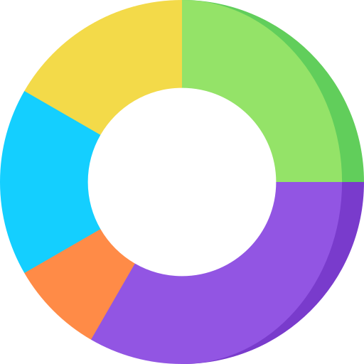
A Doughnut Chart is a circular data visualization tool that presents information in a ring-like format. Similar to a pie chart, a Doughnut Chart displays data as segments of a whole, with each segment representing a specific category or proportion. What sets it apart is the presence of a hole in the center, creating a doughnut-shaped appearance. This visualization method is effective for illustrating the distribution of data percentages in a visually appealing and easily digestible manner. Doughnut Charts are commonly used in various fields such as business, finance, and statistics to convey proportional relationships and make data interpretation more accessible. Create compelling and informative visualizations with our Doughnut Chart maker tool for a clearer understanding of your data.

How to create Doughnut Chart?
Provide a Title for Your Chart
Commence the graph customization process by providing a clear and concise title that effectively summarizes the content.
Enter Data Labels Separated by Commas
Organize your data labels by entering them with appropriate commas for a structured and easily understandable presentation.
Enter Data Values for Each Data Label
Correspondingly, input the associated data values, maintaining comma separation for clarity and accuracy.
Download Your Pie Chart in JPG/PNG Format
Conclude the customization process by downloading your pie chart in either JPG or PNG format, allowing for convenient sharing and integration into various professional documents or presentations.